Page 1 of 2
#1 Help Petro with his banners!
Posted: Sun Jun 19, 2005 11:46 pm
by Josh
Please...
My Photoshop-Fu is weak. I'm going to set up a rotating banner script in the near future.
Those who assist in this most worthy task will earn privileged positions in Petro's Private Valhalla.
Here's the deal- the images I've got in the banners have to stay, in some form, and the quotes have to be retained. (For example, in the latter example the dreadnought on the right has to stay, but the background texture on the left can go.)
The textures, colors, and fonts are all free for alteration.
#2
Posted: Sun Jun 19, 2005 11:51 pm
by Josh
Whoops, forgot one.
#3
Posted: Mon Jun 20, 2005 1:57 am
by Kreshna Aryaguna Nurzaman
Amigo, I believe it's something related to PHPBB codes instead of Photoshop. I've never tried such thing myself but you may want to take a look on these:
http://mods.db9.dk/viewtopic.php?t=1503
http://phpadsnew.com/two/
http://www.phpbbstyles.com/topic_5922.html
#4
Posted: Mon Jun 20, 2005 10:04 am
by Josh
My bad. The script isn't what I'm looking for. What I'm looking for is somebody with an ounce or two of artistic ability (notably- not me) to brush up the actual banners themselves a bit and make them look decent.
Thanks though.
#5
Posted: Mon Jun 20, 2005 10:14 am
by Dartzap
B4 seems to have what you require, he made mine after all
#6
Posted: Mon Jun 20, 2005 10:17 am
by Josh
Yeah, he and Silver do kick-ass banners- Silver did my current one. I'm the Photoshop-inadequate member of the Triumvirate. I make up for that by giving the best wedgies and noogies. Just ask Robert. :P
#7
Posted: Mon Jun 20, 2005 11:00 am
by Robert Walper
Petrosjko wrote:I make up for that by giving the best wedgies and noogies. Just ask Robert. :P
*shifts uncomfortably in seat and pulls underwear down from under arms* I really wish you'd stop doing that.
#8
Posted: Mon Jun 20, 2005 11:42 am
by zac naloen
I'll see what i can do, all my banners have been home made too, I'll post them when im done
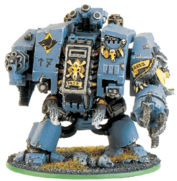
actually, you wouldn't happen to have a clearer picture of the dreadnaught would you?
#9
Posted: Mon Jun 20, 2005 12:40 pm
by zac naloen
Okay, first drafts just to get the creative juices flowing. Let me know what you like/don't like.
we can go from there


Bah, my mind isn't working its way round the dreadnaught one too well. someone else want to have a crack at that one?
And the SAAB needs a lot more work..
#10
Posted: Mon Jun 20, 2005 2:29 pm
by B4UTRUST
Zac, nice work on them, though the SAAB font is wrong in m opinion. The wording fades to much in the right pic. And just the general feel of it doesn't seem to work that great. I like the Guard pic and the titan 'naught isn't too bad either. I'll see if I can do anything myself.
#11
Posted: Mon Jun 20, 2005 4:23 pm
by Josh
Unfortunately, that's the best shot of that dreadnought that I have Zac.
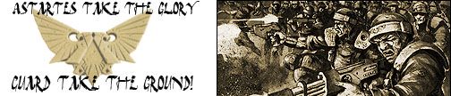
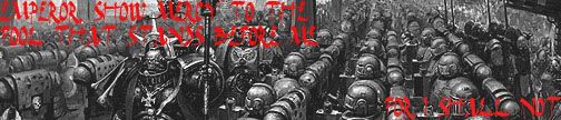
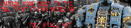
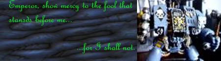
Text does need correction on that one- the original is 'Emperor, show mercy to the fool who stands before me... for I shall not."
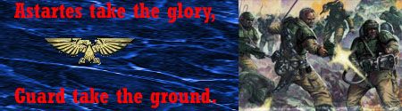
And on the Guard one, it's 'Astartes'.
I love the Guard banner, it's pretty much perfect. The dreadnought one... it's cool, but the font color might go for a bit of tweaking, I'm not sure exactly. Just something to make it a little more readable.
Excellent start, thanks. And thanks B4.
#12
Posted: Mon Jun 20, 2005 8:49 pm
by B4UTRUST
#13
Posted: Mon Jun 20, 2005 10:15 pm
by Josh
Dude, I gotta come up with some text for those first two. They may need some polish, but those are some great images, Scott.
#14
Posted: Mon Jun 20, 2005 10:25 pm
by B4UTRUST
Thanks, fortunatly I did an intelligent thing with them and saved the photoshop files so I can edit them at will. Go me for remembering to do that instead of saving 'em as Jpgs and closing em out
#15
Posted: Mon Jun 20, 2005 10:39 pm
by Josh
Okay, found one for the assembled ranks of marines- "Blessed are they that reap the sinners from the sight of the Emperor."
#16
Posted: Mon Jun 20, 2005 10:40 pm
by Josh
Oh, and for the Guard one- "You are not free, whose liberty is won by the rigour of other, more righteous souls."
#17
Posted: Mon Jun 20, 2005 10:54 pm
by B4UTRUST
I'll change them and post them up in a bit.
Edit: If anyone's interested here is a decent 'naught pic that I used and a pretty clear IG Double Eagle
#18
Posted: Tue Jun 21, 2005 12:09 am
by Josh
I see a Space Wolf dreadnought, and all I can think is... 'Good doggy!'
#19
Posted: Tue Jun 21, 2005 12:27 am
by B4UTRUST
Here are a few more I just whipped up. Let me know what you think Josh
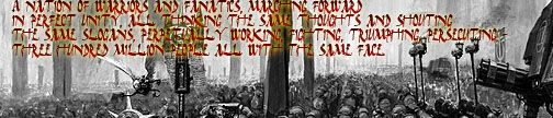
"A nation of warriors and fanatics marching forward
In perfect unity, all thinking the same thoughts and shouting
The same slogans. Perpetually working, fighting, triumphing, persecuting-
Three hundred million people, all with the same face."
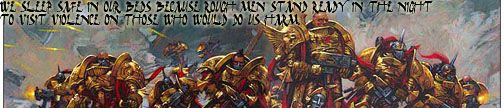
"We sleep safe in our beds because rough men stand ready in the night
To visit violence on those who would do us harm."
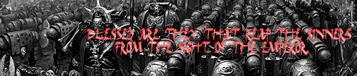
"Blessed are they who reap the sinners
From the sight of the Emperor."
#20
Posted: Tue Jun 21, 2005 12:11 pm
by zac naloen
Dreadnaught part 2.

im still not happy with this one.
Text fixed.

I have an idea for the SAAB one that im gonna work on, will post later.
#21
Posted: Tue Jun 21, 2005 12:21 pm
by Josh
Scott- On the last one, if you could drop the text down to the bottom so it doesn't clash with the Librarian's face, it's perfect. The other two rock, only thing would be perhaps adjusting the contrast a bit so as to make them a little more readable.
Zac- Both are good. I'll test the Dread one out on my Admin account in a moment.
#22
Posted: Tue Jun 21, 2005 12:25 pm
by Petro
Testing testing.
#23
Posted: Tue Jun 21, 2005 12:33 pm
by Josh
Perfect.
I'll save that one for the admin account and incorporate the others into a rotating script.
#24
Posted: Tue Jun 21, 2005 12:38 pm
by zac naloen
You screwed up the file type, keep it a .png if you can.. cos like.. otherwise it messes up the colours.
#25
Posted: Tue Jun 21, 2005 12:46 pm
by Josh
Okay, will do. Still have the PNG in my file folder.